-
Notifications
You must be signed in to change notification settings - Fork 1k
New issue
Have a question about this project? Sign up for a free GitHub account to open an issue and contact its maintainers and the community.
By clicking “Sign up for GitHub”, you agree to our terms of service and privacy statement. We’ll occasionally send you account related emails.
Already on GitHub? Sign in to your account
New Time Selector Interface #191
Comments
|
I use Android myself and really found the new interface pretty cool. I’m currently working on a rewrite of the core picker that I hope would allow us to customize the extensions much more easily to create these interfaces. I’d really like to see that in action. |
|
👍 My JS-fu is non-existent and truth be told I'm a little afraid of it 😿. I'll just have to hope someone agrees and implements it. |
|
Ooh love this UI, @amsul im game to help implement! |
|
Have to admit that the new android time picker is one of my favorites. Quite elegant. |
|
@amsul, How's the re-write coming? This would be really sweet, and I love your library. Cheers! |
|
👎 In particular, a common use case is to open the existing time field and choose a time that's 30 minutes after. With the current UI it is trivial. It's like a dropdown with values, perfect. Consider that this might not be a universally accepted change if you make this the default UI in your timepicker. |
|
Nothing wrong with having the choice between the two. On 26 February 2014 17:21, Denis notifications@github.com wrote:
|
|
Oh, yeah, if it's a choice, then it's great! I'm just wary of it replacing the main option. :) |
|
bad interface, my around don't like this interface also me too |
Hi,
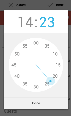
I stumbled upon this project and am very impressed, it's lovely and you've done a great job. I thought I'd share an idea I thought of when I first used the time picker which can be a bit nicer: use the new Android calendar time select style.
It can be seen here: http://googlesystem.blogspot.de/2013/05/new-google-calendar-controls-for-android.html
Hours:

Minutes:

Regards,
Russ
The text was updated successfully, but these errors were encountered: