Description
Description
Details
Details
Related Objects
Related Objects
Event Timeline
Comment Actions
Change 734369 had a related patch set uploaded (by Esanders; author: Esanders):
[mediawiki/skins/MinervaNeue@master] Increase specificity of talk button selector
Comment Actions
The patch above fixes the talk button in this task, but there are other selectors in that file that might need looking for other regressions.
Comment Actions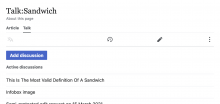
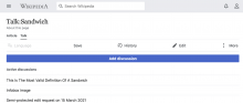
Is the issue that this is not centered or that it's not full width?
The max width was an intentional change to bring us in line with the style guide which says that buttons have a max width. This button looks a bit odd when full width on desktop for example.
Why is this button special? If we remove the special casing it looks like:
The above patch makes it look like this which seems far worse:
cc @alexhollender
Comment Actions
I think if you are going to set a max-width you need to update the styles of the buttons that have been specifically set and designed to be 100% width, that may include centring.
Given that other styles were overridden by the upstream change (e.g. the missing margins), I think these styles need to be audited, but in the meantime should revert to how they were originally intended (in T230695).
Comment Actions
to be honest I'm not sure I ever considered the design of the button/page on larger screens. I think the full-width button on mobile was meant to emphasize the action, but looking at it again (and considering larger screens) maybe the most simple thing is to remove the special width treatment? We could maybe add an icon to the button if we wanted to emphasize it more?
| mobile | wider |
|---|---|
in any case I hope it's fair to consider this @iamjessklein's decision going forward
Comment Actions
I'm not particularly concerned about larger screens at the moment, as desktop minerva is an edge case. I think we should merge the patch above to fix the regression, and consider the button width later. We may end up using a completely different design/location for the button anyway.
Comment Actions
. I think we should merge the patch above to fix the regression
This is not a regression.
On mobile there is no visual regression:
As @alexhollender points out we never considered tablet / desktop in this original design.
While the UI has changed here,
In T283757 and https://gerrit.wikimedia.org/r/c/715991 we intentionally updated the button spec to match the current design guidelines. One of those guidelines is that there should be a max-width on the buttons, so this would be an expected consequence of those changes.
IMO the Minerva specific CSS code here should be removed in favor of the current design specification and if the design specification is wrong, please change it.
Comment Actions
That patch also changes the button to add margin:0 with a specificity of 2. That seems problematic as now any button that wants to sent a margin has to use two selectors, causing breakages like this.
Why does the button class need to set the margin?
Comment Actions
Why does the button class need to set the margin?
It probably doesn't need to. I think it's probably fine (and a good idea) to remove.
Comment Actions
Change 734770 had a related patch set uploaded (by Esanders; author: Esanders):
[mediawiki/core@master] Follow-up I86568863: mw-ui-button: Reduce specificity of margin rule
Comment Actions
Change 734770 merged by jenkins-bot:
[mediawiki/core@master] Follow-up I86568863: mw-ui-button: Reduce specificity of margin rule
Comment Actions
Change 734369 merged by jenkins-bot:
[mediawiki/skins/MinervaNeue@master] Remove custom styling from 'Add discussion' button
Comment Actions
Test wiki on Patch Demo by JKlein (WMF) using patch(es) linked to this task was deleted:
Comment Actions
Note: I've made a note to remind us to revisit how and where the Add discussion affordance appears here: T295101#7518017.