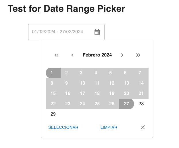
A customizable and easy-to-use calendar component built with React and Material-UI.
- Select a date range by clicking on the calendar icon and choosing start and end dates from the pop-up calendar.
- Navigate through months and years to select the desired date range.
- Display the selected date range in a text field.
- Easily integrate into your React applications.
run webpack server
npm run test:startTo install the calendar component, simply run:
npm install inncol-date-range-pickeror
yarn add inncol-date-range-pickerimport React from 'react';
import { DateRangePicker, Dates } from 'inncol-date-range-picker';
function App() {
const handleChange = (date: Dates) => {
console.log('Selected date range:', date);
};
const onClear = () => {
console.log('On clear function');
}
return (
<div>
<h1>Calendar Component Demo</h1>
<DateRangePicker
onClear={onClear}
startDate={new Date()}
endDate={new Date()}
onChange={handleChange}
/>
</div>
);
}
export default App;//
// Types
//
type Dates {
start?: Date;
end?: Date
}
//
// Props:
//
// The start date of the selected date range. Defaults to the current
startDate: Date
// The end date of the selected date range.
endDate: Date
// Callback function triggered when the selected date range changes.
onChange: (dates: Dates) => void
// Callback function triggered when the selected date range is cleared.
onClear: () => voidat Inncol Contributions are welcome! Please feel free to submit any issues or pull requests.
- Fork the project
- Run the project in development mode:
$ npm run dev - Make changes.
- Add appropriate tests
- $ npm test
- If tests don't pass, make them pass.
- Update README with appropriate docs.
- Commit and PR
- Update CHANGELOG
npm run version
This project is licensed under the GNU General Public License Version 3, 29 June 2007 - see the LICENSE file for details.
